The airport compass
3 years ago, I got inspired by a very interesting figure published on a paper by Geoff Boeing called “Urban spatial order: street network orientation, configuration, and entropy”

This figure represents the distribution of the orientation of every street of major cities.
I like how it gives a quick representation of each city’s layout and how evident are the various levels of entropy. You can easily recognise the cities which have a complex system of streets and those who have a simpler grid layout.
Shortly after seeing this chart, I immediately thought of replicating this view for airports’ traffic worldwide.
Sources and code
For this project I used two major open-source datasets, so that anyone who wants, can replicate it freely. I made the source-code available on my GitHub here.
Instead of using streets of cities, I needed to use routes of airports.
The airlines routes data comes from @jpatokal’s OpenFlights repository
The airports data is from @davidmegginson’s OurAirports repository
The latter is community-driven dataset and is updated on a frequent basis. The airline routes dataset, however, is 10 years old! If you would want to see a version using the latest aviation data from WINGX, please let me know!
Later in this post I go through what tools I used and how to replicate the images below.
Outcomes
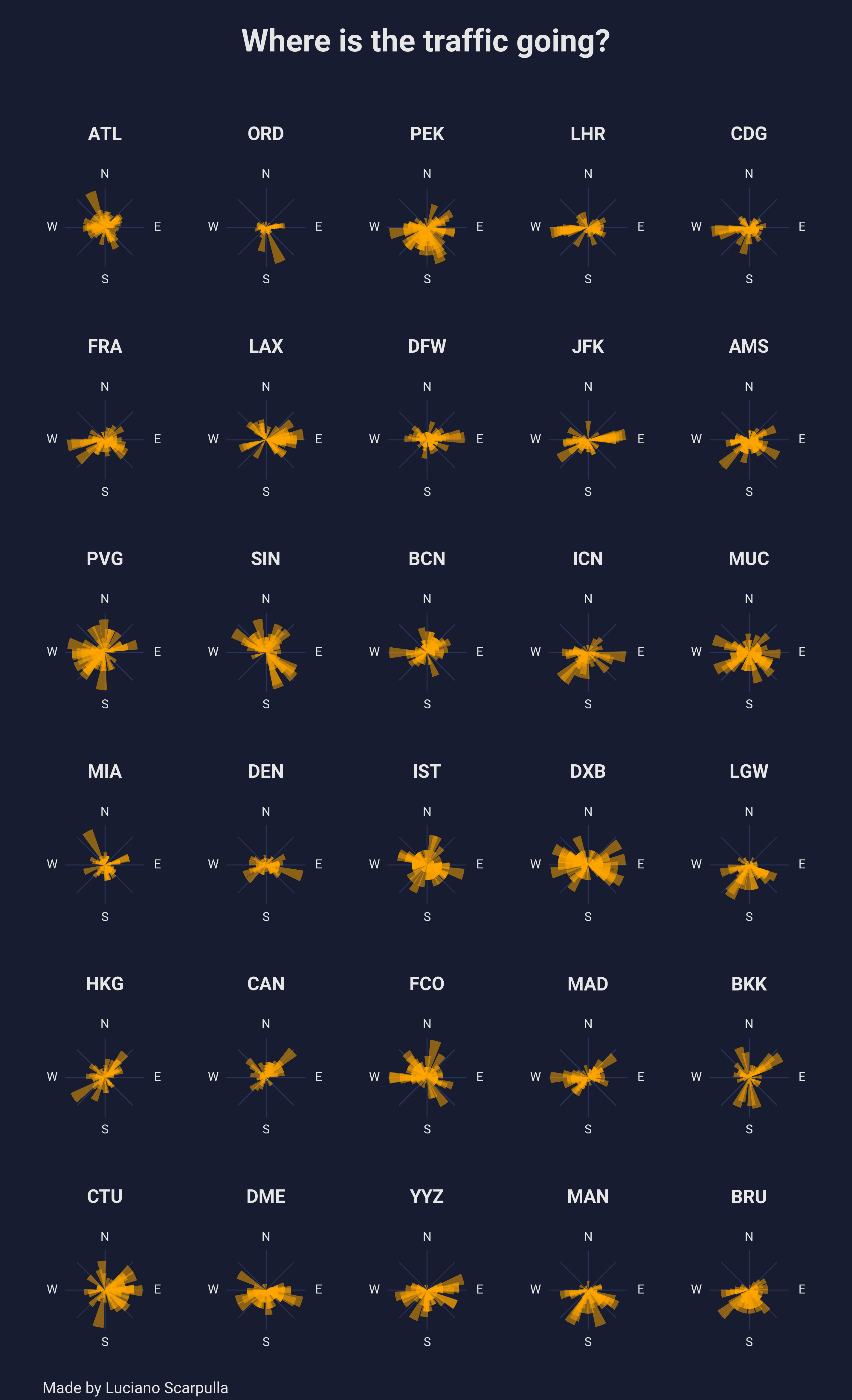
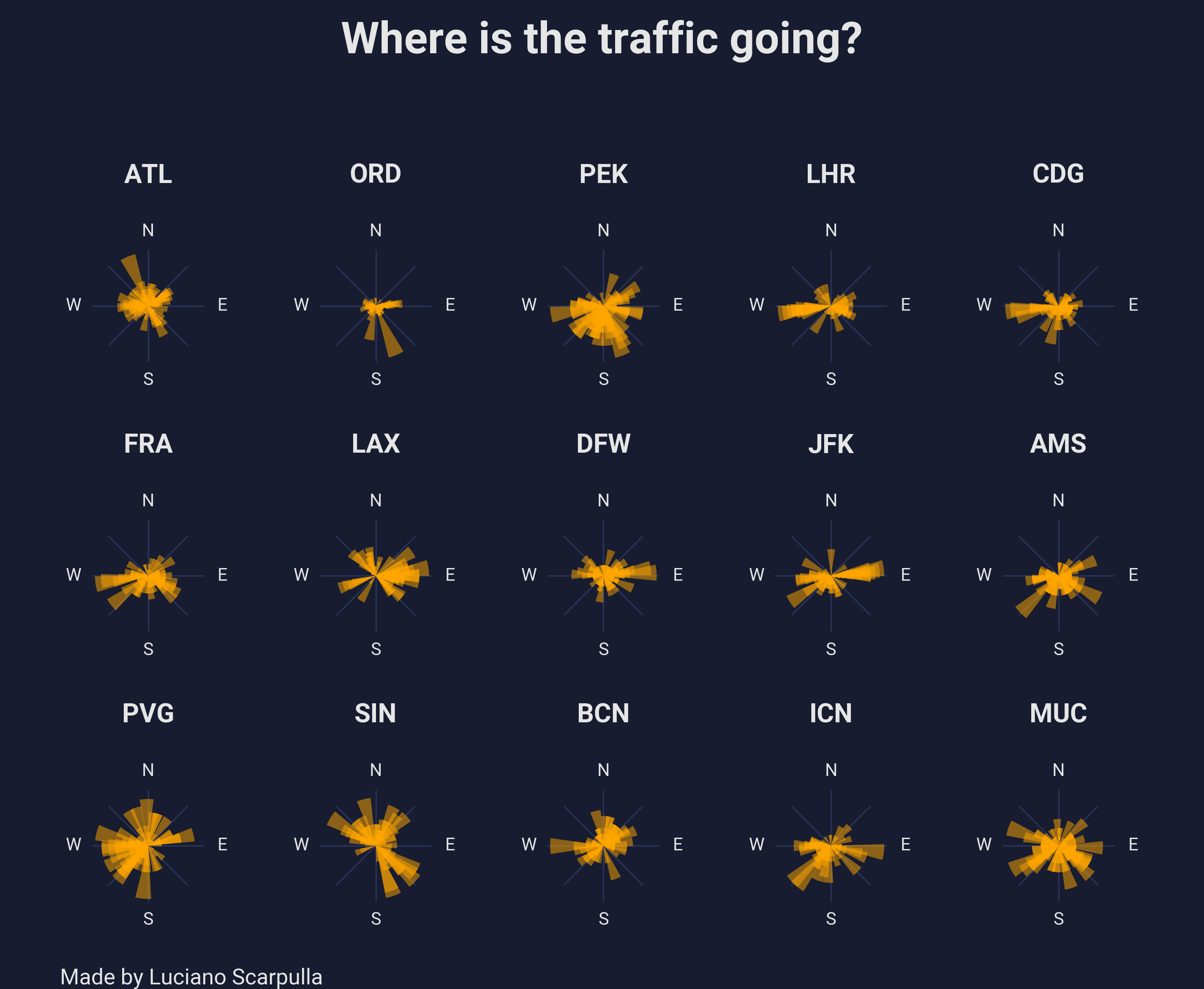 Compasses from 15 major airline airports
I first generated the top 15 airports by number of destinations. Overall, I am quite happy with how the image looks. From North to South, East to West, it is possible to quickly find out what type of traffic each airport is having (in terms of departures). I have also generated a larger poster, containing the top 30 airports, which can be found at the end of this post.
Each chart (or compass) displays the distribution of outbound flights and alligns those for each inital bearing. The longer the yellow bar, the more frequent is that bearing. For example, if an airport has most of the departures pointing West (or 270°), you would see the longest bar pointing left.
A closer look
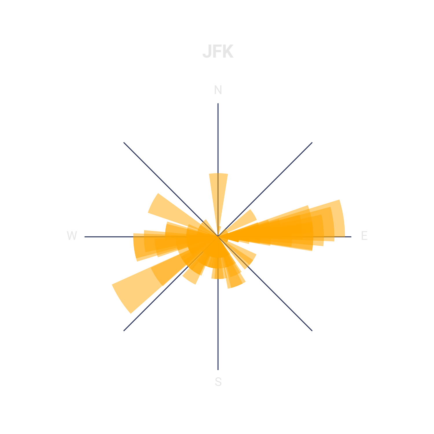
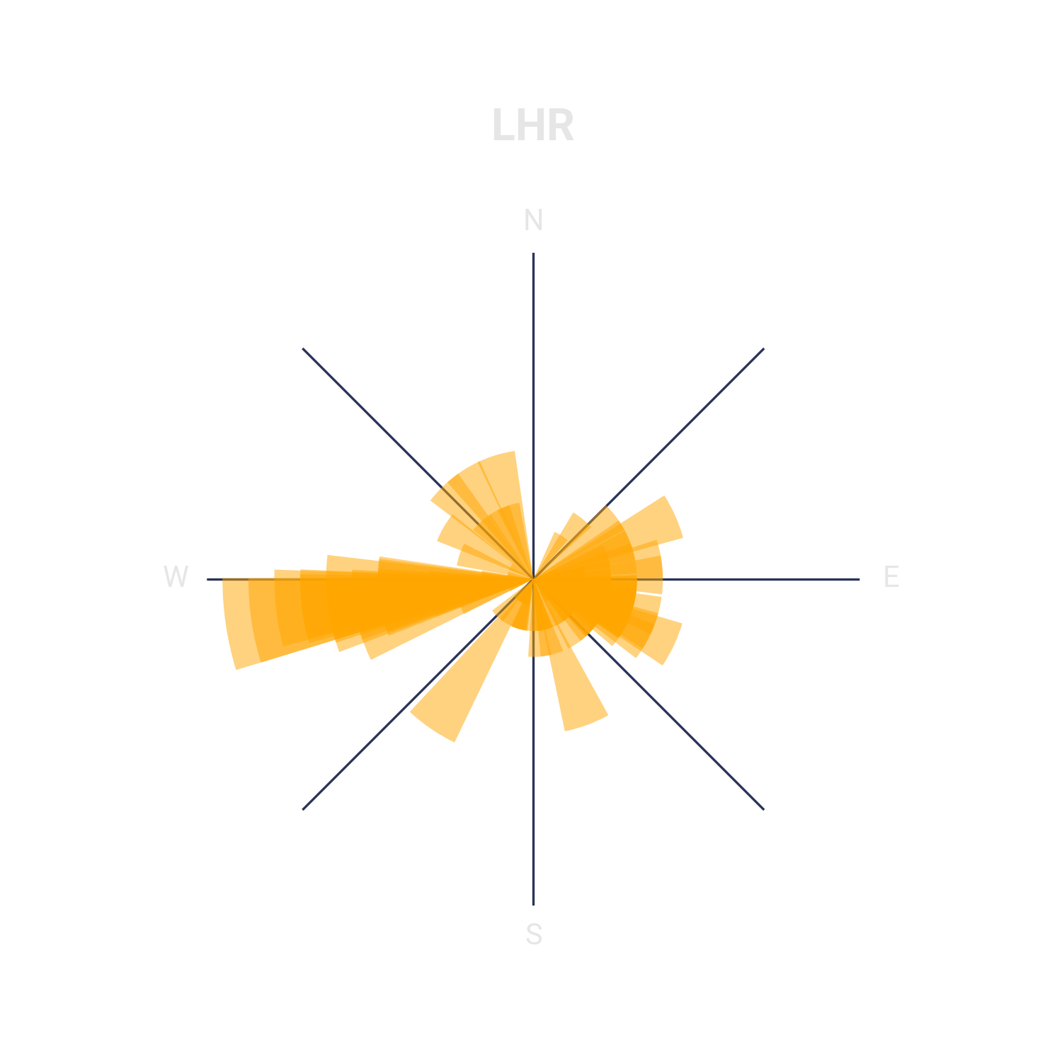
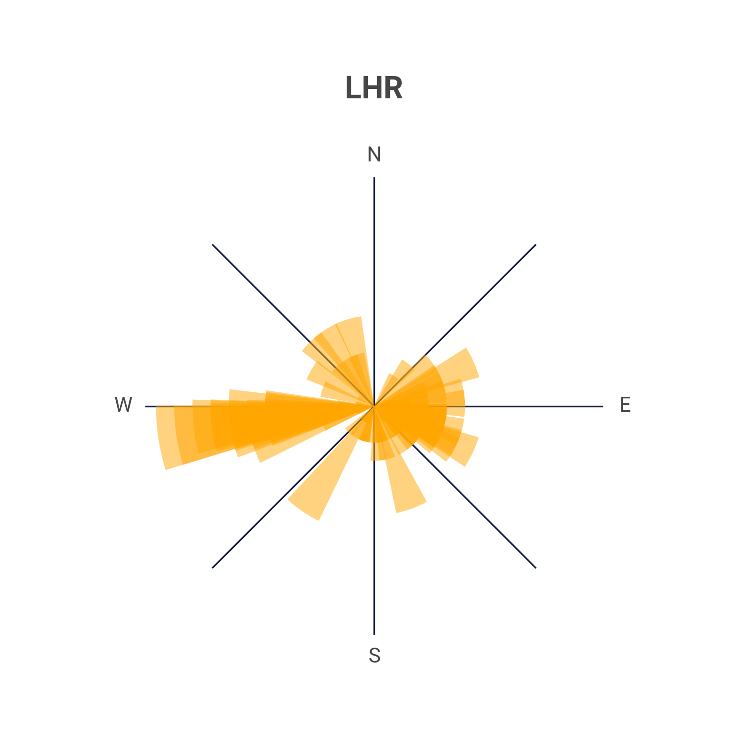
Some airports like New York JFK and London Heathrow (LHR) represent an important hub for transatlantic flights. In these charts, we can see how LHR has a long bar towards West (towards the North America) and JFK has one towards East (Europe).
Other airports’ compasses, instead, are majorly driven by the geographical constrains of their location. Tokyo’s Narita Intl. Airport is a very good example to illustrate this case. 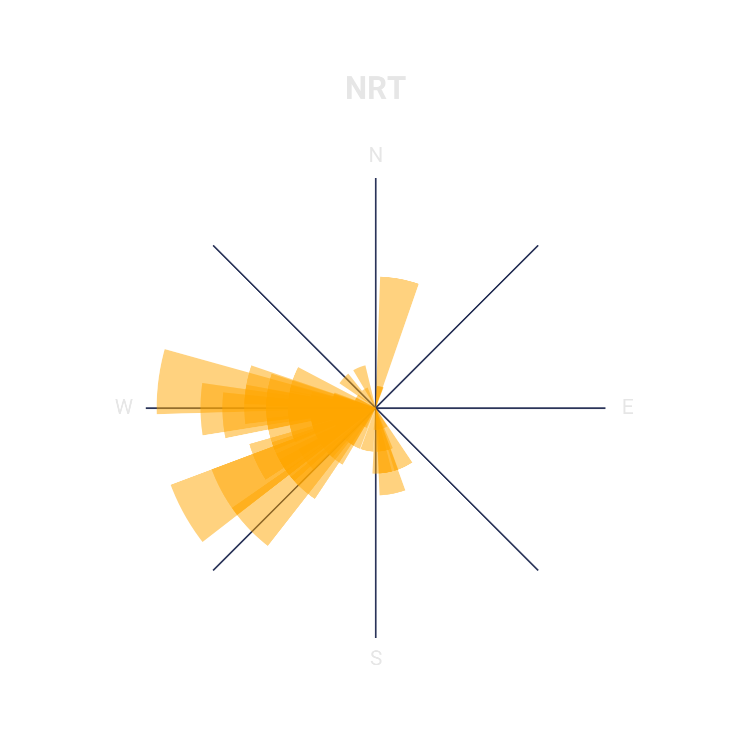
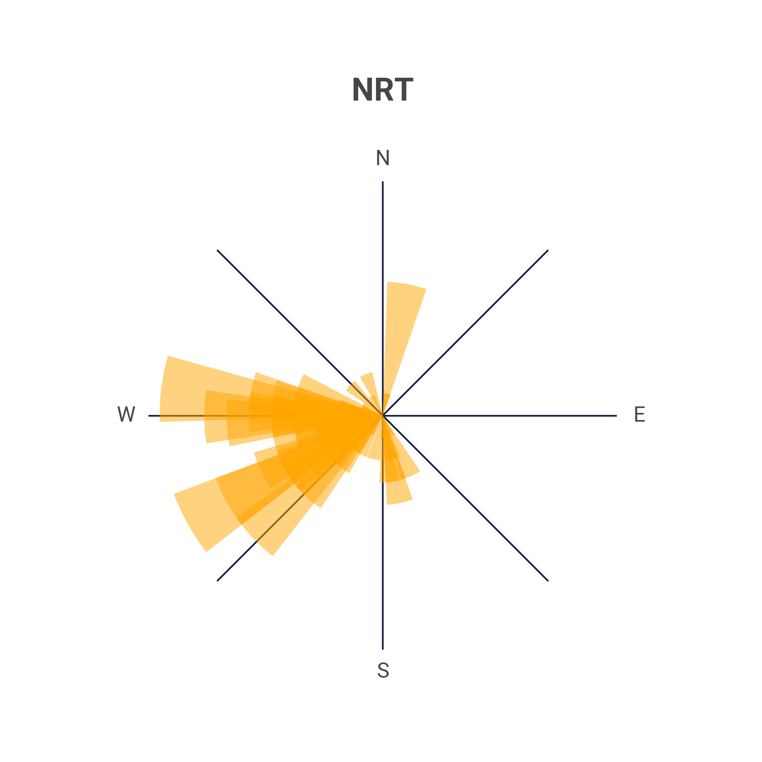
It has virtually no routes pointing eastwards! This is because Japan has the Pacific Ocean to its east side and most of the routes connecting Japan to North America are flying with an initial bearing pointing North! (Since this would be the shortest great circle path)

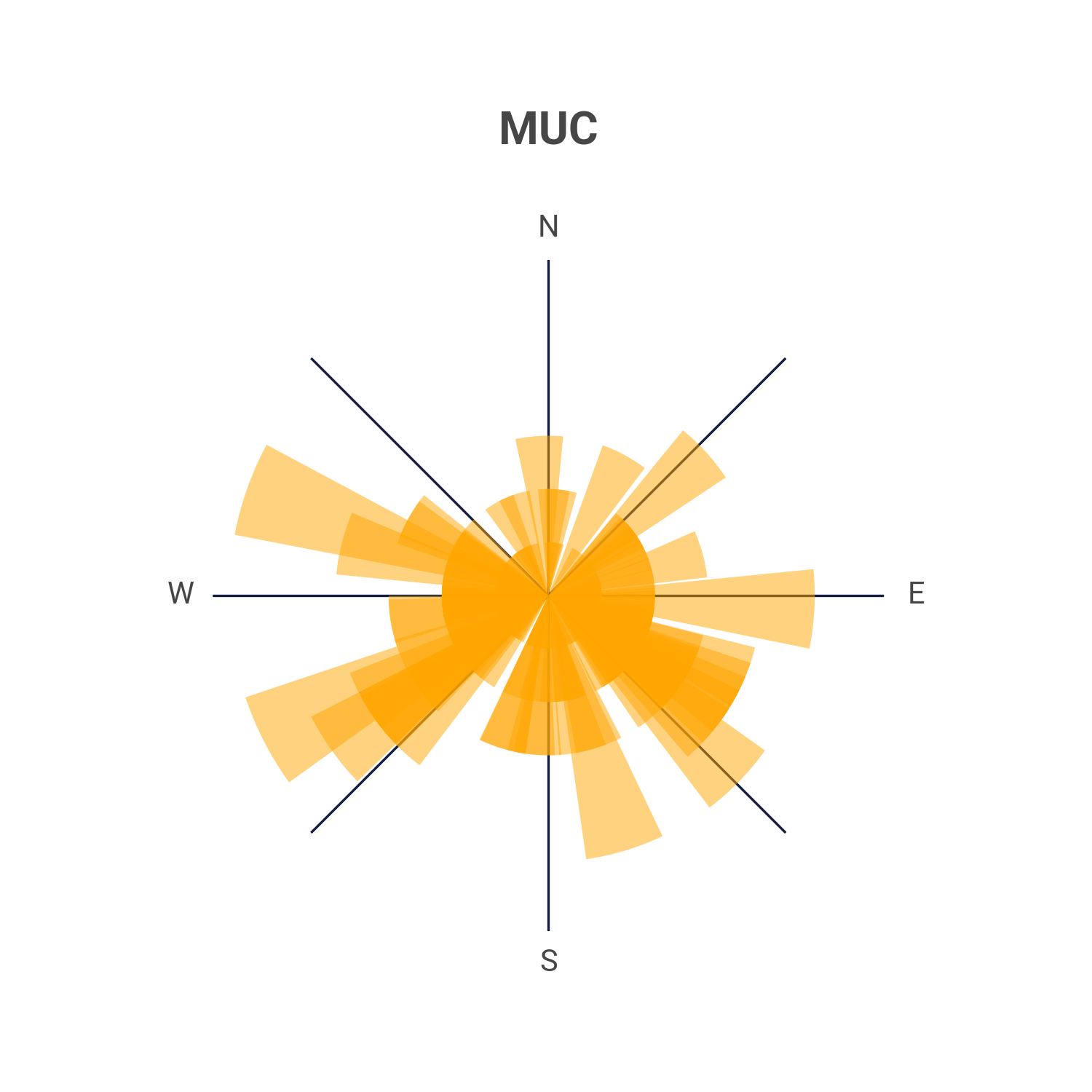
By looking at other airports, such as Munich, we can notice how their central hub function is also represented in the plot.
How-to
As I said earlier in this post, I am using two freely available datasets and published the source code to replicate these charts.
Everything is made entirely using Python:
- To merge and transform the data I used pandas
- matplotlib is used for the visualization
Data
First, I set a constant to represent the number of airports I want to have in the final view. In this example, we are going to start with 30. The csv data can be conviniently loaded directly from GitHub using the read_csv method.
1
2
3
4
5
6
7
8
9
10
import pandas as pd

TOP_AIRPORTS = 30

# Getting airlines' routes data:
routes = pd.read_csv(
    "https://raw.githubusercontent.com/jpatokal/openflights/master/data/routes.dat",
    usecols=[0, 2, 4],
    names=["airline", "origin", "destination"],
)
This first dataset doesn’t come with headers, hence why we need to use the names argument to specify the column names.Also, we are just interested in knowing the origin and destination airport of each route (Column 2 and 4), I also added the airline IATA code (Column 0) because I was curious, but not needed for this project.
We are also not interested in displaying all airports on this dataset. To do so, we can get the Top airports by grouping the data, ordering it and accessing only until the TOP_AIRPORTS constant number, all of which can be easily done like below.
1
2
3
4
5
6
7
8
9
# Selecting only top airports
top_airports = (
    routes.groupby("origin")
    .destination.count()
    .sort_values(ascending=False)
    .index[:TOP_AIRPORTS]
)

routes = routes.loc[routes.origin.isin(top_airports)]
Now, we are just having data about each airlines’ routes. But in order to plot the data into small compasses, we will need to calculate the initial bearing of each airport pair. And in order to do so, we also need the coordinates of each airport.
1
2
3
4
5
# Getting airports data:
airports = pd.read_csv(
    "https://raw.githubusercontent.com/davidmegginson/ourairports-data/main/airports.csv",
    usecols=["ident", "iata_code", "latitude_deg", "longitude_deg"],
)
OurAirport’s data comes in handy as it has exactly what we are looking for! Since the previous dataset only has IATA airport pairs we can join both origin and destinantion using a loop.
1
2
3
4
5
6
7
8
9
10
# Merging routes with airports info:
df = routes # <-- making another reference for convinency
for direction in ("origin", "destination"):
    df = df.merge( # df is mutated for each direction
        airports.rename(columns=lambda x: x + f"_{direction}"),
        left_on=direction,
        right_on=f"iata_code_{direction}",
        how="left",
    )
While looping for origin and destination we also make sure that the columns in the airport dataset are suffixed with “_origin” and “_destination” respectively. The final dataframe (df) will now have the origin and destination IATA codes as well as the coordinates for those IATA pairs. We can now calculate the bearing (angle) for each pair.
1
2
3
4
5
6
7
8
9
import numpy as np

# Getting initial bearing for each route:
df["angle"] = np.degrees(
    np.arctan2(
        df.latitude_deg_destination - df.latitude_deg_origin,
        df.longitude_deg_destination - df.longitude_deg_origin,
    )
)
Numpy can do all the math for us with a resulting column “angle” which contains all angles for each pair.
Since we would want to have a sense of the “distribution” of routes for each angle, we can make a resulting dataframe by doing a final aggregation:
1
2
# Aggregating final data:
res = df.groupby(["origin", "angle"]).destination.count()
The data is now ready for the visualization!
Visualization
We can dynamically create the layout of our “poster” by dividign the total number of airports by the number of columns we want to have. Considering that the columns will dictate how “wide” will the final image be.
1
2
ncols = 5
nrows = len(top_airports) // ncols
Now we can set up the figure and axes of our plot
1
2
3
4
5
6
fig, axes = plt.subplots(
    nrows=nrows,
    ncols=ncols,
    subplot_kw=dict(projection="polar"),
    figsize=(ncols * 1.9, nrows * 2.6),
)
Feel free to setup the parameter figsize with your own ratios, or leave them as is. I am comfortable with the ones above
We can fill each axis with a for-loop
1
2
3
4
5
6
7
8
9
10
11
12
13
14
for ax, airport in zip(axes.flatten(), top_airports):
    airport_data = res.loc[airport]
    ax.bar(
        np.radians(airport_data.index),
        airport_data.values,
        width=0.3,
        color="C2",
        alpha=0.5,
    )

    ax.set_title(f"{airport}\n", fontdict=dict(fontweight="bold"))
    ax.set_yticks([])
    ax.set_rlabel_position(90)
    ax.set_xticklabels(["E", "", "N", "", "W", "", "S", ""], fontdict=dict(fontsize=10))
Here, axes.flatten() confiniently “flattens” out the nested array that axes is. It originally was a structure like this: [[ax1,ax2],[[ax3, ax4]]] Where the inner array represent each row and the items inside the arrays are the axis inside the columns. With flatten we now have it like this: [ax1,ax2,ax3,ax4]
We don’t need the ticks for the Y axis so we turn them off using ax.set_yticks([])
The set_xtickslabels currently raise a UserWarning which we can safely ignore1.
1
2
3
4
fig.suptitle("Where is the traffic going?", fontsize=25, fontweight="bold")
fig.text(0.05, 0.005, "Made by Luciano Scarpulla") # Insert your name
fig.tight_layout(pad=3)
fig.savefig(f"Where is it going {TOP_AIRPORTS}.png", dpi=300)
We can finally add a title to the whole figure and, additionally, our credit. Depending on how many airports you decide to plot, you may want to change the padding and the dpi of the image (To avoid generating huge posters)
Full code
There are some styling tweaks I made so that the image looks the way it looks. There is a whole new post that can be made on how to tweak matplotlib to look less “accademic”.
You can find the full code on GitHub (link). There you can see the python file along with the styling sheet I made for matplotlib. Feel free to fork the repository and make your own changes!
What’s next?
I first developed this 3 years ago and I re-adapted my old code for this post. There are some changes and improvements that can be made. For example:
The data is grouped by each unique bearing, which means that if a route is at a 269 degree angle, it will create a separate bar to those routes with a 270 degree angle. This can be fixed my simply rounding the angles, or, even better, distributing the angles into different buckets (e.g 130-140 degrees, 140-150, etc.)
The image is a static outlook at airlines’ routes of 2014. Many things can be done to update it. For example, a seasonal outlook could be made so that you could notice the differences in the “orientation” in certain airports.
Bigger poster
Footnotes
The script is an adatpatation of an old script of mine which was using an older version of matplotlib. I still need to adapt this part to the latest version. ↩